HENNET has Rebranded! New Year, New Look!

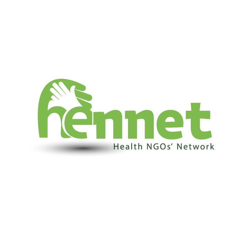
Have you seen our new logo? Yes, HENNET has rebranded! The secretariate is glad to announce that HENNET has a new logo. This was an overdue change that was finally effected in 2022. See HENNET’s new logo on the cover photo.
Why the colour Green?
In the natural world, the colour ‘Green’ is everywhere. It is a colour associated with good health, balance, harmony, rebirth, regeneration. Also the greener your plate the more nourished you are likely to be. In the same spirit, HENNET seeks to bring balance and harmony in the health CSO space!
Why the hands?
What better way to describe what health CSOs do than to refer to the phrase Ubuntu? Ubuntu is an ancient African phrase meaning ‘I am because we all are.’ It emphasizes on the need to act in ways that are beneficial to our communities. HENNET strives to make the health CSOs co-exist, support and work together as one for a healthier Kenyan society. The hands represent the collaboration and partnership necessary for any progress to be achieved in the policy influencing and advocacy space, every CSO counts. HENNET is because health CSOs are!
Out with the old and in with the new!
With the new look, the HENNET secretariate anticipates to enhance;
- Policy Engagement, Evidence Generation and Advocacy
- Coordination and Representation of Health CSOs
- HENNET Membership and Capacity Development
- Strategic Partnerships Development
- Institutional Capacity Development at HENNET
In this new year let us all continue working together for good health of the people of Kenya!


